Lowercase, plain sans, no polish — the anti-design text look
Brat Font Generator
This brat font generator turns a phrase into the lowercase, deliberately plain text style that took over 2024: unadorned sans-serif, wide letterspacing, monospace, small caps and a strikethrough or underline for the smudged, low-effort feel. Every result is real Unicode, so the brat text keeps its look when you paste it into a bio, a caption, a playlist title or a group-chat name.
Brat Font Copy and Paste
Type your phrase in lowercase, compare the previews, and press Copy beside the one that reads right. The plain 𝗌𝖺𝗇𝗌, the w i d e spacing and the s̶t̶r̶u̶c̶k̶ letters are Unicode characters rather than a styled font, which is why a brat font generator result survives a paste into Instagram, TikTok, Spotify or a WhatsApp group name. The famous lime-green background is a colour, not text, so that part stays with your image editor.
Popular Brat Font Styles
The brat look is defined by what it refuses to do. Plain sans-serif (𝖻𝗋𝖺𝗍) in all lowercase is the core: a system-font feel with no weight or flourish. Spaced letters (b r a t) push the slacker mood further. Monospace (𝚋𝚛𝚊𝚝) reads like a text file. Small caps (ʙʀᴀᴛ) stay flat and quiet. A strikethrough (b̶r̶a̶t̶) or a thin underline adds the crossed-out, unfinished quality, and a single ○ or ─ around the word is as decorative as it should get. Anything with sparkles or script is the opposite of brat.
brat summerCaption or playlist titlei did it for the plotBio lineclub classicsGroup chat name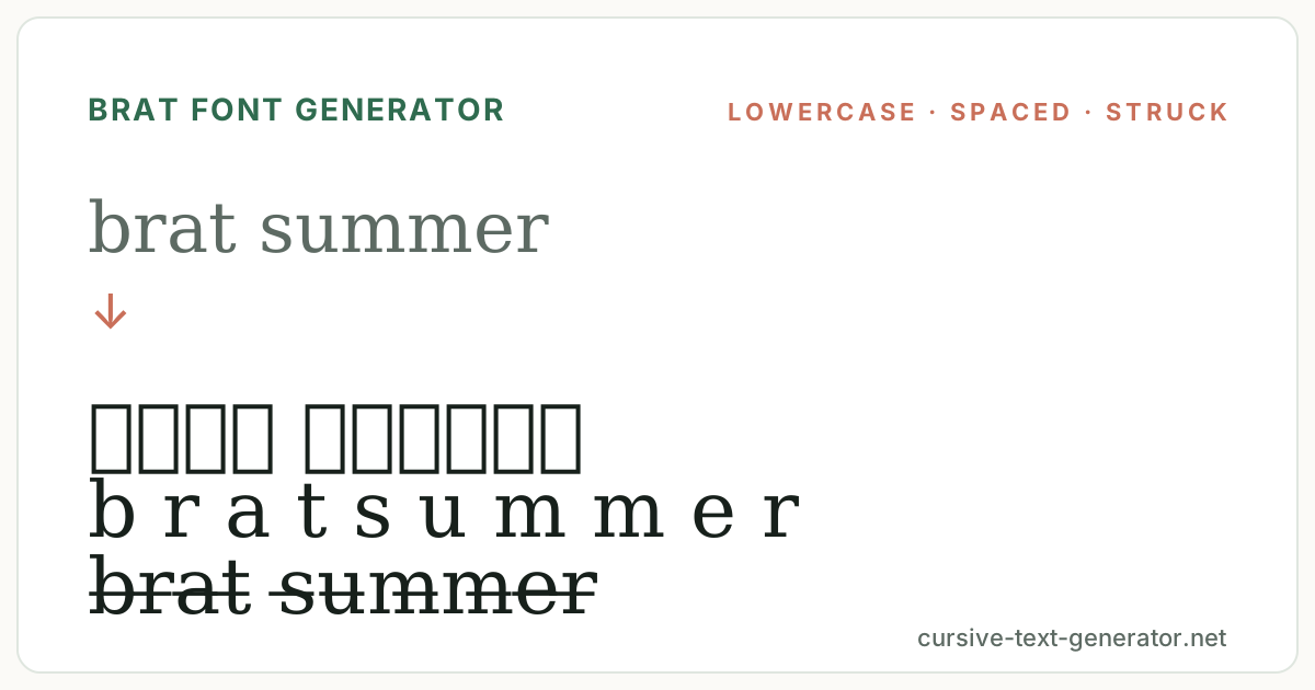
How to Use the Brat Font Generator
- 1. Type in lowercaseEnter a word, phrase or name. Lowercase is the whole point; uppercase input will still convert but loses the look.
- 2. Pick the flavourUse the chips to move between plain sans, spaced, struck-through and bracketed presets and compare them with your exact text.
- 3. Copy and pastePress Copy, then paste into your bio, caption, playlist title, display name or message.
Brat Fonts for Instagram, TikTok and Spotify
Brat text lives in captions and titles more than in names: an all-lowercase caption under a photo, a Spotify playlist called whatever you like in plain sans, a TikTok bio line, a group chat renamed for a trip. A display name in spaced lowercase works too, though very wide spacing can exceed a name field's limit. In captions, keep it to one line and leave hashtags in ordinary characters so they still link. The lowercase-and-plain look reads as intentional only when everything around it is loud, so avoid pairing it with emoji frames.
Good to know: combining strikethrough and underline marks are the characters most likely to be stripped or shown oddly by an app; if a save fails, use the plain sans or spaced preset instead.
Brat Font Generator vs Y2K and Aesthetic Text
Y2K text is glossy and decorated; most aesthetic text is soft and dreamy. Brat is neither: it is the flat, lowercase, low-resolution look of a word typed in a default font and stretched over a plain colour, an anti-aesthetic that became an aesthetic. This brat font generator therefore leads with plain sans and spaced text and keeps decoration to a single thin line or circle, while the Y2K and aesthetic pages on the site handle the sparkle-and-script end of the spectrum.
The plain sans-serif letters come from the Mathematical Alphanumeric Symbols block of the Unicode Standard, which is why they render on any modern phone without a font install.
What Makes Text Look Brat: Lowercase, Blur and Restraint
Three things carry the brat look. The first is lowercase everywhere, including the first letter of a name; capitals immediately read as effort. The second is a plain, slightly narrow sans-serif with even spacing, the feel of an unstyled system font. The third is blur and low resolution, which text cannot do directly but can suggest: spaced-out letters, a thin strikethrough, an underline that looks like a leftover link, or monospace that looks like a raw text file.
This brat font generator maps each of those to a preset family. Plain sans and small caps supply the flat weight. Spaced and fullwidth supply the stretched look. Strikethrough, underline and double-underline supply the smudged, edited-then-abandoned quality. A thin ─ dash or ○ circle is the only framing that fits; the bracket and rule presets are included for a harder, more industrial read.
Restraint is the skill here. One preset per line, all lowercase, no emoji, no sparkles. If a line starts to look designed, it has stopped looking brat. The generator will happily combine a strikethrough with wide spacing, but the strongest version of this style is usually the plainest one, so preview the simplest preset first and only add a mark if the word needs it.
Brat Text Examples
Paste these into the generator to compare how the same lowercase phrase carries in plain sans, spaced and struck-through styles.
brat summerCaption or playlist titlei did it for the plotBio lineclub classicsGroup chat nameExplore Related Font Styles
Brat Font FAQ
What is the brat font?
The look people mean is a plain, slightly narrow sans-serif in all lowercase, stretched and blurred over a flat colour. It is a design treatment rather than one named typeface, and this page recreates the text part with plain-sans, spaced and struck-through Unicode.
Is this brat font generator free?
Yes. It runs in your browser with no account or download, and every result can be copied without limits.
Can I get the green background too?
Not from a text generator. The colour belongs to an image, so make the text here and place it over a plain lime background in any photo or story editor.
Why does my text look sharp instead of blurry?
Unicode cannot blur letters. Spaced, struck-through and underlined presets suggest the low-resolution feel; for real blur, screenshot the text and soften it in an image editor.
Does brat text work in an Instagram bio or TikTok name?
Yes. Plain sans, small caps and spaced text are widely accepted. Strikethrough and underline marks are occasionally stripped by a name field, so keep those to captions.
Is this the actual font from the album cover?
No. That artwork uses a licensed typeface and a specific image treatment. This generator only assembles standard Unicode characters that resemble the lowercase, plain-sans style and does not reproduce the artwork.
Should I type in lowercase?
Yes. Lowercase is the defining feature of the look. The presets convert capitals as well, but a capitalised word reads as ordinary styled text rather than brat.