Cursive W Stroke Order
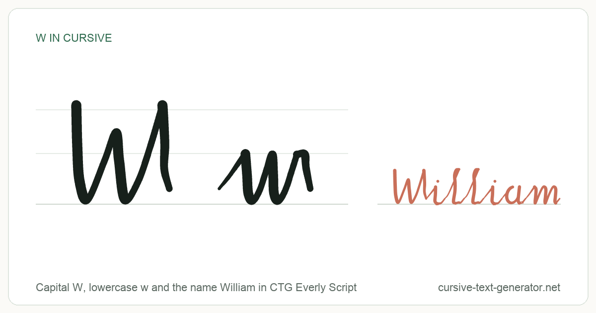
How to Write a Capital W in Cursive
A cursive capital W is three connected upstrokes — three peaks with two valleys between them — and the whole letter is written without lifting the pen.
- Start just under the cap-height line and make a small entry hook to the right.
- Pull straight down to the baseline. That is your first valley.
- Swing back up to full cap height for the second peak.
- Drop to the baseline again, then rise a third time.
- Finish the final peak with a small curl to the right. That curl is what carries into the next letter.
The capital W is one of the few cursive capitals that connects forward cleanly, which is why names like William and Wren flow so easily. Keep the three peaks the same height — a shrinking third peak is the giveaway of a rushed capital W.
How to Write a Lowercase w in Cursive
The lowercase w is the same two-valley shape at half the size, but its exit stroke behaves differently from almost every other letter.
- Start on the baseline and sweep up to the x-height line.
- Come down to the baseline for the first valley.
- Rise back to the x-height, then drop for the second valley.
- Rise a final time and close with a small loop at the top of the x-height.
That last step is the one people get wrong. Every other lowercase letter hands off at the baseline; the w hands off from the top.
The Hard Part: Joining w to the Next Letter
Because the w exits high, it cannot connect the way a letter like n or u does. The letters that follow have to be entered from above:
- w + a, o, d, g — these round letters normally start with an upstroke from the baseline. After a w you drop into them from the top instead, which is why was and word feel awkward at speed.
- w + h, k, l, b — easiest join. The tall loop already begins high, so the exit curl feeds straight into it.
- w + i, e, r, s — comfortable. Come down out of the curl into a normal baseline entry.
The letters o, v, and b share this high exit. If your handwriting breaks down in a specific word, check whether one of those four letters sits just before the break.
Cursive w vs Cursive u
Both are two valleys, which is exactly why they get confused. The difference is entirely in how they end: the w closes with a small loop at the top of the x-height, while the u finishes at the baseline and joins low. In fast handwriting the two are told apart by the exit, not the body.
Cursive W Mistakes: Ending at the Baseline, Rounded Valleys
- Ending at the baseline. This turns a w into a u. The single most common cursive W error.
- Rounding the valleys. Cursive W valleys come to a point. Rounded ones read as a doubled u.
- Uneven capital peaks. All three peaks of a capital W reach cap height; a short middle peak reads as a lowercase w scaled up.
- Lifting the pen mid-letter. Both the capital and lowercase W are single continuous strokes.
Names Starting With W in Cursive
- William — 𝒲𝒾𝓁𝓁𝒾𝒶𝓂
- Willow — 𝒲𝒾𝓁𝓁ℴ𝓌
- Wyatt — 𝒲𝓎𝒶𝓉𝓉
- Wren — 𝒲𝓇ℯ𝓃
Words Beginning With w in Cursive
- winter — 𝓌𝒾𝓃𝓉ℯ𝓇
- wander — 𝓌𝒶𝓃𝒹ℯ𝓇
- whisper — 𝓌𝒽𝒾𝓈𝓅ℯ𝓇
Want a full word or sentence instead of a single letter? Use the cursive letters generator, or the cursive name generator for names. To practise the strokes above on paper, print a sheet from the cursive practice sheets.
Cursive W FAQ
What is the cursive W?
The cursive W is the joined-up, handwritten form of the letter W. The capital is a single unbroken stroke with three peaks at cap height and two valleys on the baseline; the lowercase is the same two-valley shape confined to the x-height, ending with a small loop at the top rather than on the baseline. Online, “cursive W” also refers to the copy-and-paste Unicode characters (𝒲 and 𝓌) in the table above, which imitate that handwritten shape in text fields.
How do you write w in cursive?
In short: start on the baseline, sweep up to the x-height, then make two pointed valleys down to the baseline and back up, and finish with a small loop at the top of the x-height. Do not lift the pen, and do not end at the baseline — ending low turns the w into a u. The capital works the same way but spans the full cap height with three peaks instead of two. Full step-by-step instructions and the stroke-order diagram are further up this page.
How do you write TJ in cursive?
TJ is normally written as two cursive capitals side by side rather than joined, because the cursive capital T ends with a downstroke that does not carry forward into the next letter. Write the T first — a horizontal entry stroke across the top, then the stem down to the baseline — then lift and start the J at cap height, curving down through the baseline into a descender loop that swings left. As copy-and-paste characters that pair is 𝒯𝒥. If you actually mean the lowercase pair in a word like outjump, the t exits at the baseline straight into the j’s descender loop, and you cross the t only after finishing the word: 𝓉𝒿. See J in cursive for the descender in detail.
Why can’t Gen Z read cursive?
Mostly because they were never taught it. The 2010 Common Core standards in the US specified print handwriting and keyboarding but not cursive, and many states dropped it from the curriculum, so a large share of Gen Z had no systematic instruction in reading or writing joined-up script. That has partly reversed since — a number of states, California among them, have legislated cursive back into elementary grades in recent years. Reading cursive is largely pattern recognition, and the W is a good illustration of why it is hard without training: its exit stroke leaves from the top instead of the baseline, so a handwritten was or word looks nothing like the printed version to an untrained eye.
Can I copy and paste a cursive W?
Yes. Every W on this page is a Unicode character, not an image, so clicking it copies real text. Paste it into an Instagram bio, a TikTok display name, a Discord nickname, or a document and the cursive shape travels with it — no font to install.
Why does the cursive W look different in each row?
Each row comes from a different Unicode block. Cursive Script and Bold Cursive come from the Mathematical Script ranges and Old Style Script from Fraktur; Double-Struck and Clean Monospace have blocks of their own and are listed separately above because they are decorative rather than cursive. They are all separate character sets that happen to resemble handwriting.
Is the cursive W here a real handwriting font?
No. These are Unicode characters, not a downloadable typeface. That is why they work in fields that never let you change the font. If you need an actual font file for print or design software, see our cursive font generator page.
Which cursive W should I use in a signature?
Cursive Script (𝒲) reads closest to a handwritten capital W and is the safest choice. Bold Cursive (𝓦) holds up better at small sizes, such as an email signature line. Old Style Script (𝔚) is Fraktur, which reads as gothic rather than flowing, so it suits logos more than signatures.
Will a cursive W show up on every device?
Usually, but not always. These characters need a system font that covers the Mathematical Alphanumeric Symbols range. Current iOS, Android, Windows, and macOS all ship one; a few older Android builds and some Linux setups do not, and there the letter falls back to an empty box. If a W has to be readable everywhere, use a plain W.